
Websites Built Around How People Actually Use Them
We build professional digital experiences where structure, interface and responsive development work together to make information easier to find and every page easier to use
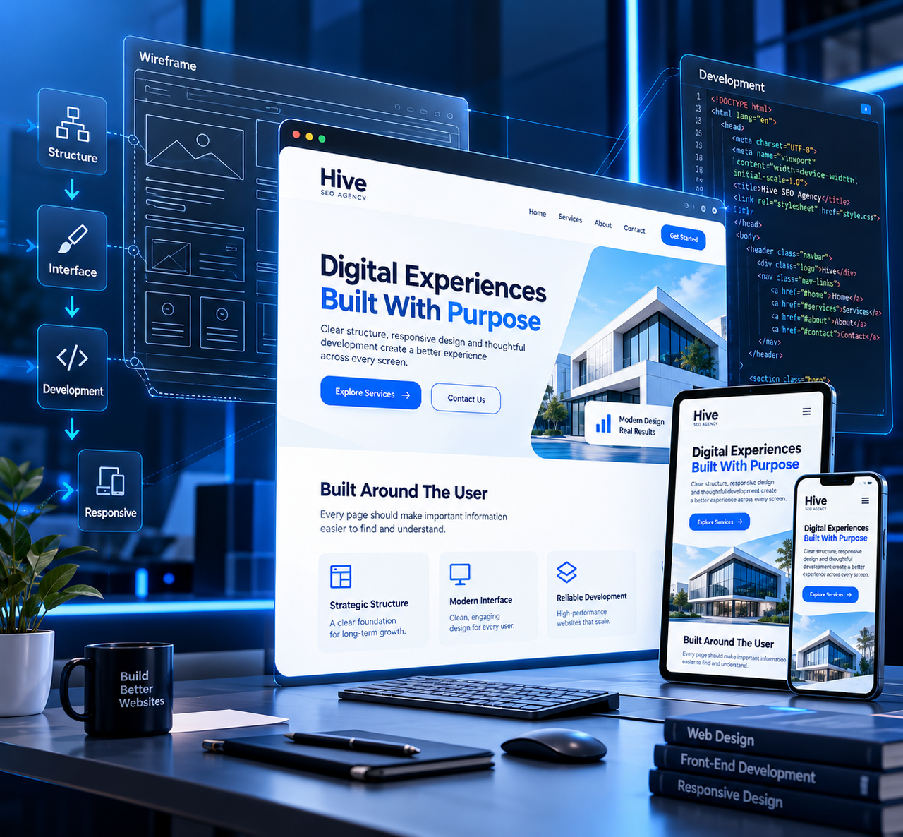
A Better Website Starts With Better Decisions
A website becomes easier to design when its structure makes sense first. Pages need a purpose, navigation needs a clear path and important information needs an obvious place within the overall experience
That means thinking beyond individual sections. We consider how visitors move between pages, where key information belongs and how the website can remain consistent from the first screen through to the final contact point
Websites Shaped Around Different Digital Needs
The structure and interface should respond to the type of website being created rather than forcing every project into the same layout
Business Websites
Professional multi-page websites that organize company, service and contact information into one consistent digital presence
Service-Based Websites
Websites designed around clear service presentation, supporting information and practical routes for visitors to make contact
Portfolio Websites
Structured personal or professional websites that present expertise, selected work and essential information without unnecessary complexity
Landing Pages
Focused page experiences built around one clear message, strong visual hierarchy and an easy-to-understand next action
Blog & Content Websites
Page structures that make articles, categories and supporting content easier to browse across different screen sizes
Custom Business Pages
Individual pages developed around specific business requirements while remaining consistent with the wider website experience
Useful structure helps visitors understand where they are and what comes next
Every Section Needs A Reason To Be There
Professional web design is not about stacking attractive sections until a page looks full. Navigation, headings, content areas and calls to action should each support the visitor's understanding of the page
Once that structure is clear, the interface can give it visual hierarchy through spacing, typography, responsive layouts and consistent components
One Website Different Screens
Responsive development is more than shrinking a desktop layout until it fits on a phone. Navigation, spacing, content width and visual hierarchy all need to adapt when the available screen changes
The goal is a website that remains understandable and practical whether someone reaches it from a desktop, tablet or mobile device
From Initial Direction To A Complete Website
Each stage moves the project closer to a usable, consistent website rather than treating design and development as disconnected tasks
Understand The Website
Clarify the purpose, audience, required pages and important project requirements
Organize The Pages
Establish how the main pages connect and where important information should live
Shape The Experience
Develop the visual hierarchy, section structure and reusable interface direction
Build The Pages
Turn the planned interface into functional website pages and components
Adapt Across Screens
Review layouts, navigation and content presentation for desktop, tablet and mobile
Prepare For Launch
Complete the final website review and organize the finished experience for launch
What Makes A Website Feel Complete
A professional website is usually the result of many details working consistently rather than one dramatic visual element. Visitors should be able to understand the interface without having to learn how to use it
Clear Navigation
Important pages remain easy to locate and reach
Visual Hierarchy
Content is organized so important information stands out
Responsive Layout
Page structure adapts to different screen widths
Consistent Interface
Pages feel like parts of the same digital experience
Practical Functionality
Interactive elements support what visitors need to do
Clean User Journey
Visitors can move through the website with less friction
A Website Is A Connected System
The homepage may introduce the experience, but it cannot do every job. Service pages, supporting information, articles and contact routes all contribute to the complete website
When those pages share consistent navigation, spacing, visual language and content hierarchy, the website feels like one product rather than a collection of unrelated screens
Built As A Complete Digital Experience
The final website is approached as a connected set of pages, components and responsive behaviours rather than a single desktop design
Responsive Page Layouts
Page structures prepared for desktop, tablet and mobile experiences
Structured Navigation
Clear routes between the important areas of the website
Consistent Design System
Shared visual rules that help individual pages feel connected
Mobile-Friendly Interface
Navigation and content presentation adapted for smaller screens
Functional Components
Practical page elements developed around the requirements of the website
Launch-Ready Structure
A complete website framework prepared for its intended online use
Questions Before We Start Building
Quick answers about website requirements, responsive layouts, multi-page builds and preparing a project for development
Let’s Give It Structure
Share the type of website you need, the pages you have in mind and the direction you want to create for your digital presence